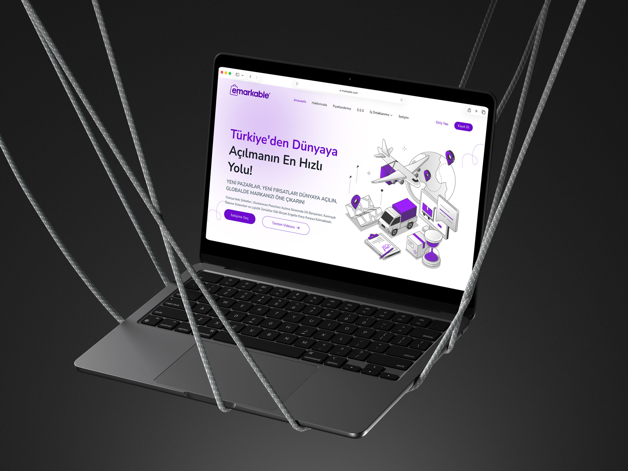
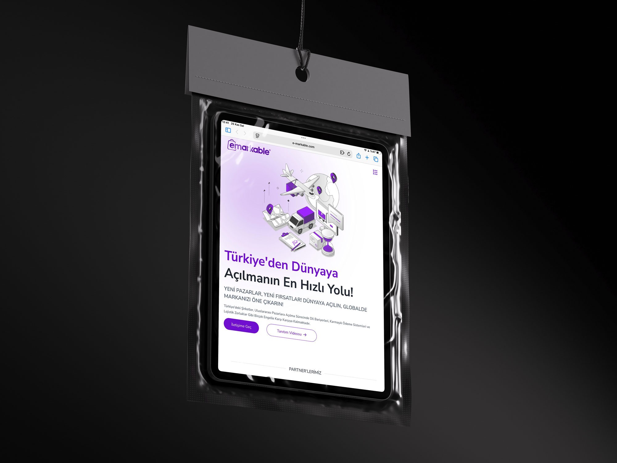
The previous interface had unclear messaging, outdated visuals, and weak CTA guidance. Users struggled to understand the flow, and the content hierarchy did not support conversions effectively.
Modules were inconsistent, SEO structure was lacking, and the subscription area created decision friction. The platform’s global e-export identity was not clearly communicated.
The new design strengthens Emarkable’s global positioning with a clear UX flow, modern visuals, and a simplified content hierarchy. User guidance is now far more intuitive.
This project elevated Emarkable’s digital experience by delivering a clearer brand story, conversion-focused content, and a fully SEO-aligned structure.
(2022-25©)


